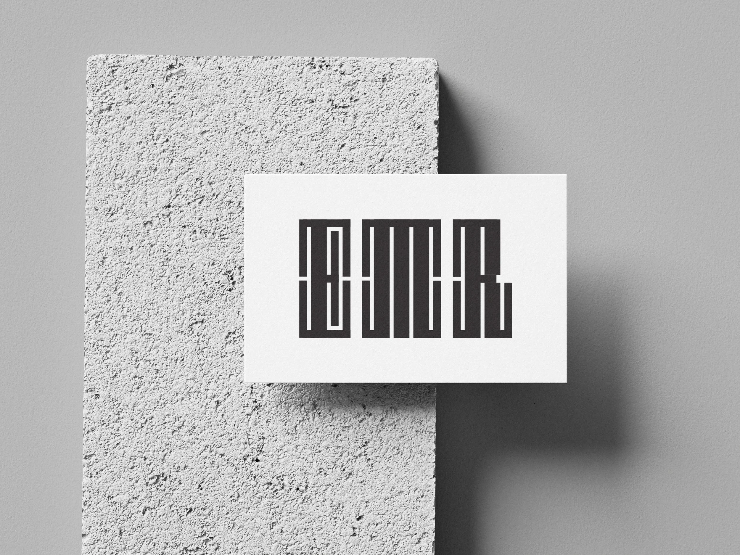
Bitmap Monogram
The bitmap monogram required a necessary understanding of vertical and horizontal lines to create a cohesive letter system that is creative, systematic, and attractive. Proportion, scale, and relationship were key elements I considered while making my bitmap monogram. The incorporation of thick and thin lines were constructed to build contrast between the foundational letterform and the modular serifs.

Process sketches


Each sketch went through numerous iterations and updates. The exploration of this project was necessary to develop a completely new monogram. After many explorations, the final decision was made based on the image on the far left due to its unique system, symmetry, and balance.

Before

No kerning, very tight lines
Letter “R” not effectively identifiable
After
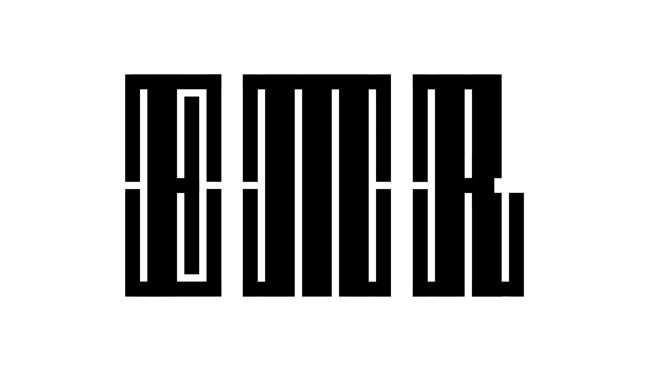
Kerning applied to increase legibility
Letter “R” adjusted for legibility