Album Cover
In my design decisions, duality is expressed in a multitude of ways. The folding of the page seen on the cover shows Kid Cudi at two different points in time but in the same space. On one hand he is partaking in his destructive impulses of smoking and on the other hand he is smiling and portraying emotional inconsistencies. Throughout the entire composition, there is a stark contrast between light and dark colors. Typographically, there are two typefaces: one is a simple sans serif and the other is a chaotic script typeface. These two typefaces parallel Kid Cudi’s internal conflict that he is experiencing. The primary use of hierarchy is typeface and size while spacing and alignment are secondary components.
Front


In the album, the artist’s lyrics speak about an internal conflict between responsibilities and escapism. Side A is an example of a one sided perception of his personality showing a cigarette in hand.
Back


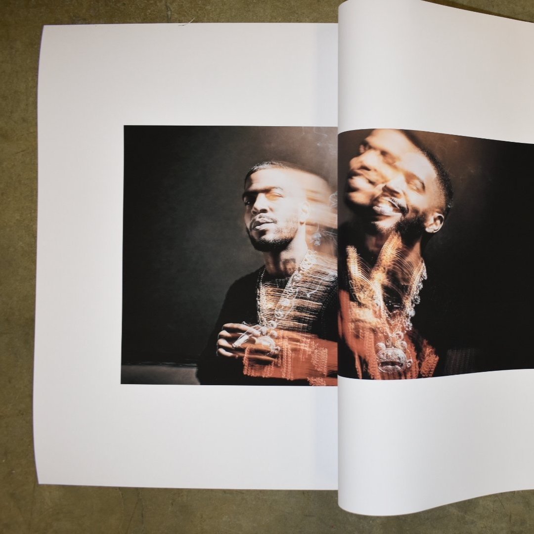
On side B, Kid Cudi is smiling. This image was as the flip side of his conflicted personality. It demonstrates both the lyrical duality and the personal internal contradiction
Digital Mockups

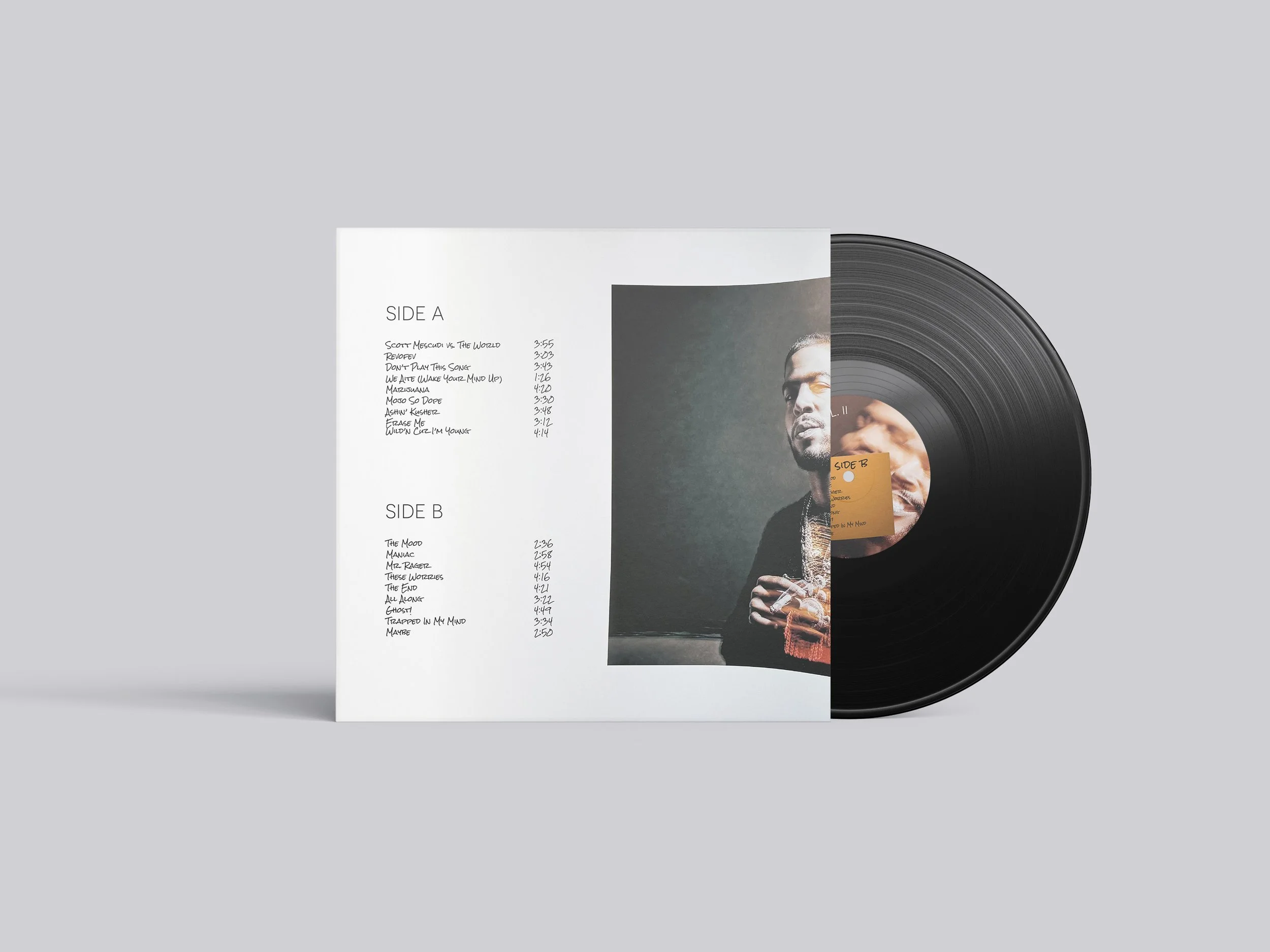


Photo manipulation
Conceptual making exploration
Physical collage

Type manipulation