U.S. City Branding
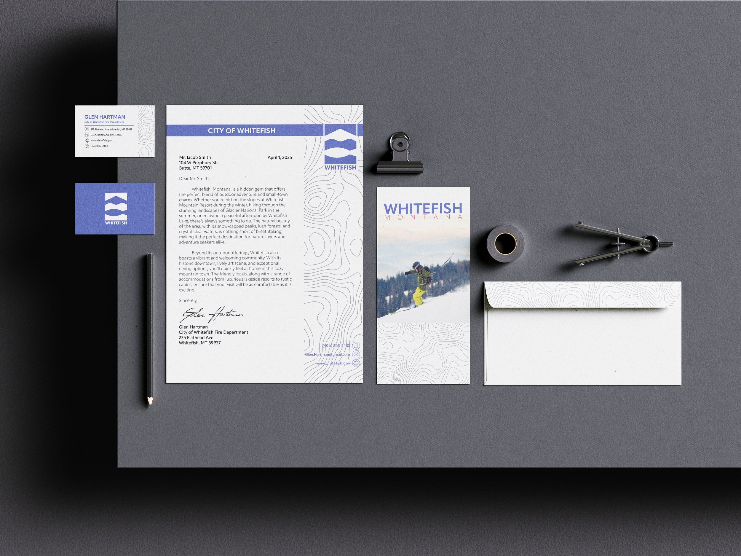
After careful research and consideration the U.S. city that I chose to rebrand was Whitefish, Montana. This city in particular is rich in recreational adventure and that is reflected in my logo. I used proportion and balance of each segment to represent different geographical locations experienced in Whitefish. This city is clean, friendly, and a modern ski town which is reflected in all aspects of my stationery packages. The city’s values are reflected in the typefaces, colors, logo and pattern in my design.

Process Sketches


Logos
Color
Black and white
Brand guidelines sheet

Brochure exterior

Brochure interior
