Magazine Spread Reboot
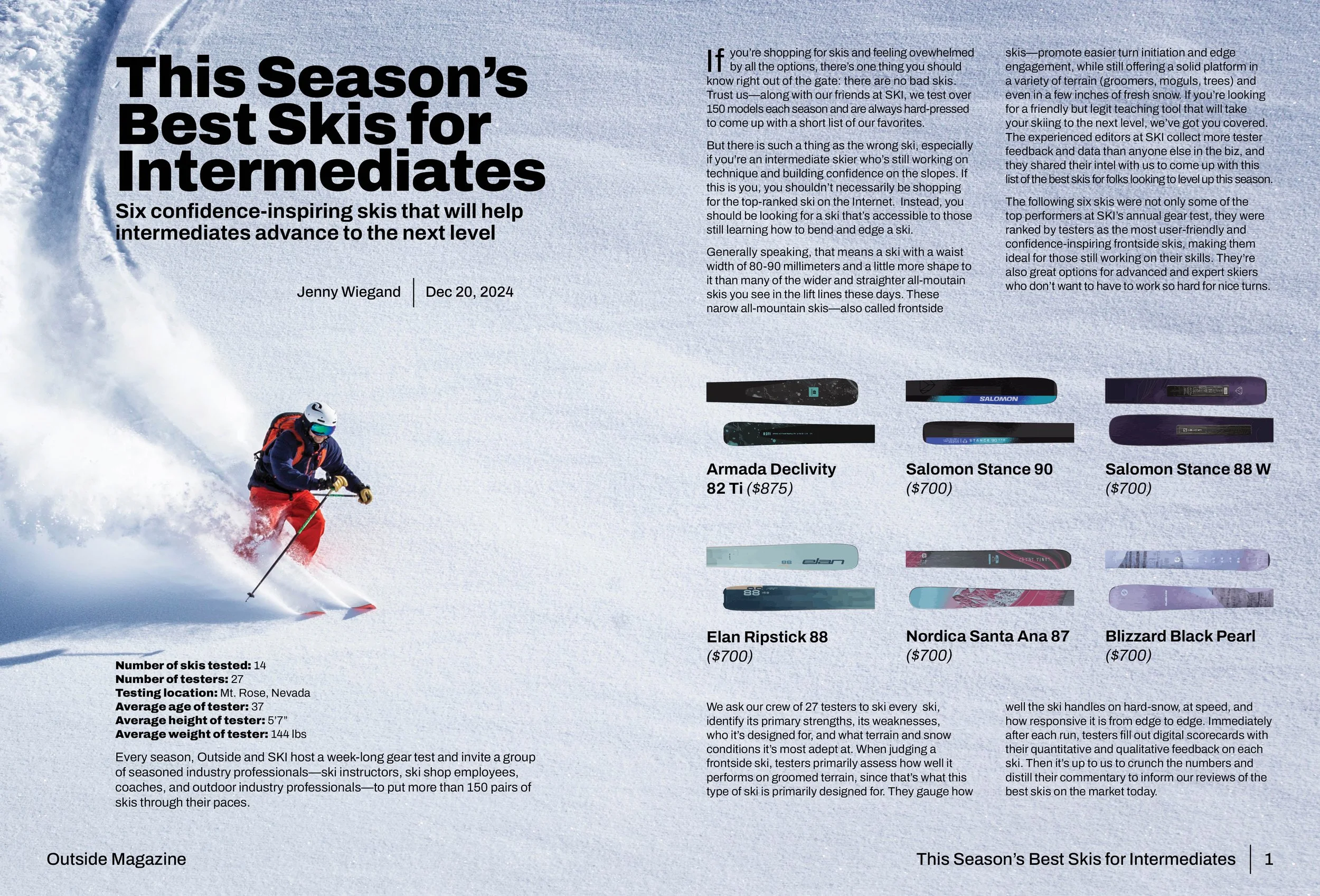
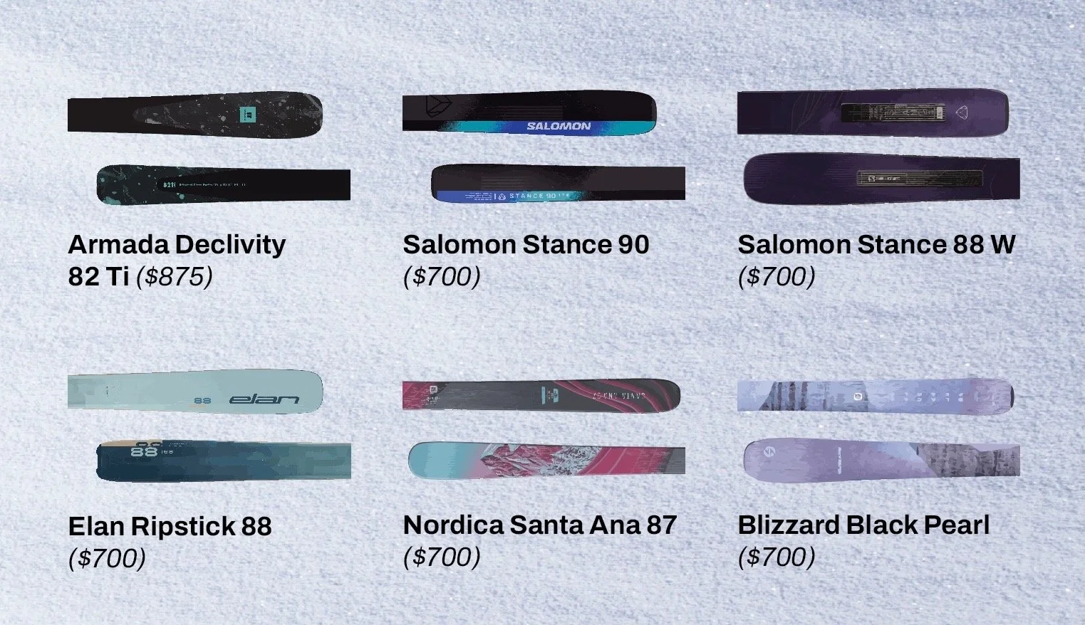
My layout concisely illustrates design concepts that are visually appealing and simple. I chose a high contrast parent image to lead the eye across the page and evoke motion appropriately affiliated with skiing without impacting the legibility of the article. The six skis are pictured in proximity and size consistency to establish a pattern and sequence. In order to gain the viewer's attention, I chose a bold title and a proportional grid system to organize typography and images within the layout. The type is organized in a consistent system to accurately deliver the information of the article while being segmented to entice the viewer.

Zoom in of image proximity
Six skis pictured in proximity using a grid to establish correlation and pattern
Final design
Flat view of the final design of the magazine spread reboot